
一周时间,开发了一款封面图生成器工具
介绍
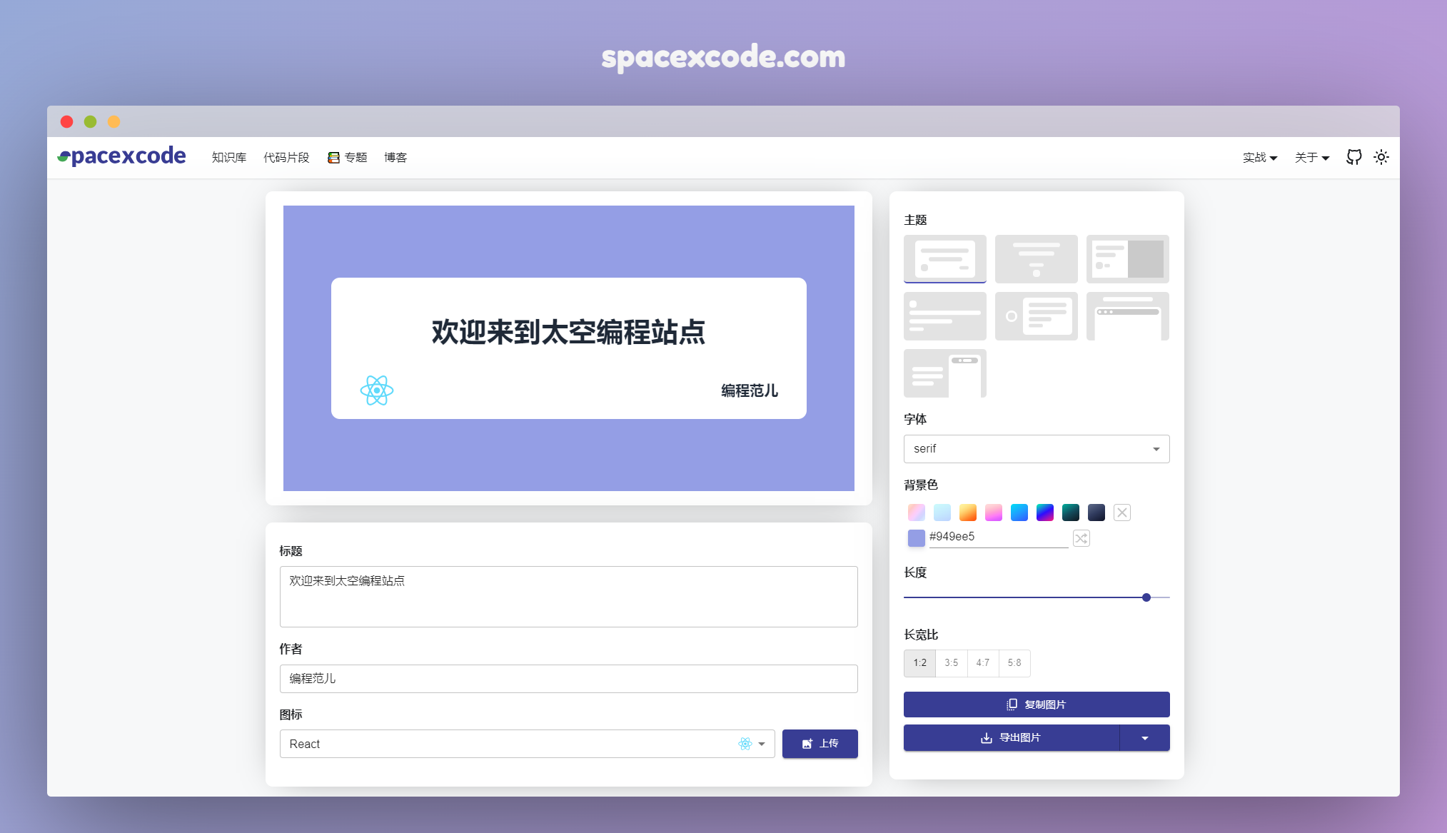
这是一款封面图的制作工具,根据简单的配置即可生成一张好看的封面图,目前已有七款主题可以选择。做这个工具的初衷来自平时写文章,都为封面图发愁,去图片 网站上搜索很难找到满意的,而且当你要的图如果要搭配上文章的标题,使用 Photoshop 等软件操作成本太大。为此突然来了灵感,何不自己开发一个在线的工具直接生成。
开发前期构思
一款工具型的软件,界面一定要简洁,操作方面。所以在布局上没有必要占满整个页面,宽屏上限定宽度然后相对居中。
内容上软件整体上会分成三块:
- 预览区域
- 内容配置区域
- 样式配置区域
这样一来布局上可以采取列布局或者行布局。我能想到的有:
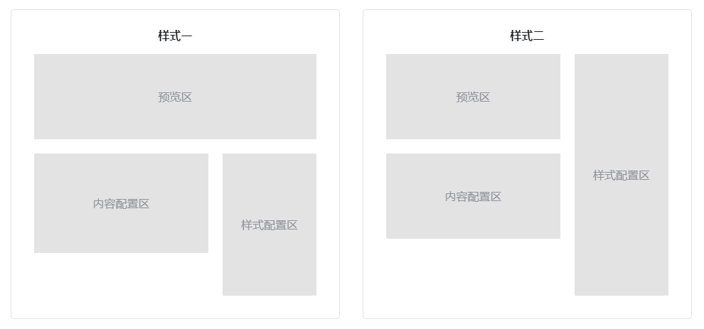
由于根据个人喜好最终定下来第二种样式的布局。
代码实现
根据布局,我定义了三个函数组件来实现对应的“预览区”、“内容配置区”和“样式配置区”和一个主页面渲染函数。
// 页面主函数
export function Main(props) {
  // ...
}
// 内容配置函数
export function ContentForm(props) {
  // ...
}
// 样式配置函数
export function ConfigForm(props) {
  // ...
}
// 封面图预览函数
export function CoverImage(props) {
  // ...
}
这里 UI 组件是引用 Material UI,也是本站引用的唯一外部 UI 框架。
页面主函数
主函数中定义了全局共享的配置变量 config 和改变状态的函数 handleConfigChange。它们两会当成参数传入到其它组件中使用。
export function Main({ normal }) {
  const coverRef = useRef();

  const [config, setConfig] = useState({
    font: 'serif',
    bgColor: '#949ee5',
    gradientBgColor: '',
    icon: 'react',
    ratio: 0.5,
    width: 800,
    title: '欢迎来到太空编程站点',
    author: '编程范儿',
    theme: 'basic',
    bgImg: 'https://spacexcode.oss-cn-hangzhou.aliyuncs.com/1704985651753-e2a2eb6d-71c6-4293-8d8c-49203c7410bb.jpeg'
  });

  const handleConfigChange = (val, key) => {
    setConfig((prev) => ({ ...prev, [key]: val }));
  };
  const downloadImage = (scale, format) => {
    // todo
  };
  const handleCopyImg = (cb) => {
    //todo
  };

  return (
    <Box sx={{ padding: '40px 0' }}>
      <Grid container spacing={3}>
        <Grid item xs={12} md={ normal ? 8 : 12 }>
          <Box className={styles.card} sx={{ padding: '20px 10px', overflowX: 'auto' }}>
            {/* 生成图显示 */}
            <div ref={coverRef} className={styles.preview} style={{ width: config.width + 'px'}}>
              <CoverImage config={config} />
            </div>
          </Box>
          <Box className={styles.card} sx={{ padding: '10px 20px 40px', marginTop: '24px' }}>
            <ContentForm config={config} handleConfigChange={handleConfigChange} />
          </Box>
        </Grid>
          {/* 配置 */}
        <Grid item xs={12} md={normal ? 4 : 6}>
          <Box className={styles.card} sx={{ padding: '10px 20px 40px' }}>
            <ConfigForm config={config} handleConfigChange={handleConfigChange} downloadImage={downloadImage} handleCopyImg={handleCopyImg} />
          </Box>
        </Grid>
      </Grid>
    </Box>
  )
}
因为页面主函数主要是集成其它三个组件,没有什么逻辑,我们来一一讲讲“内容配置函数”、“样式配置函数”和“封面图预览函数”这三个函数的实现。
内容配置函数
封面图中的内容配置就三项:标题、作者和图标。
标题和作者是两个简单的文本输入框,图标数据是我本地写了一个列表,图标本身是一段 SVG 代码。使用的 React 函数组件返回。
export function ContentForm ({ config, handleConfigChange }) {
  return (
    <>
      <Box className={styles.setItem}>
        <Typography variant="h5">标题</Typography>
        <TextField
          value={config.title}
          onChange={e => handleConfigChange(e.target.value, 'title')}
          placeholder='标题'
          size='small'
          multiline
          rows={3}
          fullWidth
        />
      </Box>
      <Box className={styles.setItem}>
        <Typography variant="h5">作者</Typography>
        <TextField
          value={config.author}
          onChange={e => handleConfigChange(e.target.value, 'author')}
          placeholder='作者'
          size='small'
          fullWidth
        />
      </Box>
      <Box className={styles.setItem}>
        <Typography variant="h5">图标</Typography>
        <Box sx={{ display: 'flex', gap: '10px' }}>
          <Select
            value={config.icon}
            onChange={val => handleConfigChange(val.target.value, 'icon')}
            label=''
            size='small'
            fullWidth
          >
            {devicons.map(el => (
              <MenuItem value={el.value} key={el.value}>
                <div className={styles.selectIconRow}><span>{el.label}</span>{selectDevicon(el.value)}</div></MenuItem>
            ))}
          </Select>
          <Button component="label" size='small' variant="contained" sx={{ width: '120px' }} startIcon={<AddPhotoAlternateIcon />}>
            上传<VisuallyHiddenInput type="file" onChange={(e) => handleConfigChange(URL.createObjectURL(e.target.files[0]), 'customIcon')} />
          </Button>
        </Box>
      </Box>
    </>
  )
}
说明下:这里我只贴主要代码。
样式配置函数
样式配置主要是对封面图的 Layout、上面文字的字体、背景色和图片的长宽进行设置。同时这个区域还包含两个操作按钮:图片的复制和导出。
主题
这里我定义了七款主题,分别对它们进行命名“basic”、“background”、“stylish”、“outline”、“modern”、“preview”和“mobile”。后面会根据 命名对主题进行调用。
在配置里,我们对不同的主题设计了 Layout 模型,放在选项中进行选择,另外还分别对它们建立了真实渲染的文件。分别放在 themes 和 themeSkeleton 两个目录下。
我们这里就以 basic 主题进行讲解,其它类似。
import { Skeleton } from '@mui/material';

export default const BasicTheme = () => {
  return (
    <div className={styles.basicTheme}>
      <Skeleton animation={false} variant="rectangular" sx={{ padding: '8px' }} width={116} height={68}>
        <div className={styles.content}>
          <Skeleton animation={false} variant="text" width={'100%'} height={10} />
          <Skeleton animation={false} variant="text" width={'70%'} height={10} />
          <div className={styles.bt}>
            <Skeleton animation={false} variant="rounded" width={10} height={10} />
            <Skeleton animation={false} variant="text" width={'20%'} height={8} />
          </div>
        </div>
      </Skeleton>
    </div>
  );
}
每个 UI 框架都有 Skeleton 骨架屏组件,我们可以直接使用它来生成我们的主题模型。很轻松就实现了布局。
而主题的渲染组件则要通过读取配置来做实现样式的定制。
export default const BasicTheme = ({ config }) => {
  const { title, bgColor, gradientBgColor, author, icon, font, customIcon, width, ratio } = config;
  const height = width * ratio + 'px';
  return (
    <div className={styles.basicTheme}>
      <div className={styles.main} style={{ backgroundColor: bgColor, backgroundImage: gradientBgColor, height: height }}>
        <div className={clsx(styles.content, styles['font-' + font])}>
          <div style={{ padding: '0 3rem' }}>
            <h1>{title}</h1>
          </div>
          <div className={styles.bt}>
            {
              customIcon ?
                <div className={styles.customIcon}>
                  <img src={customIcon} alt="img" />
                </div>
                :
                <div className={styles.devicon}>
                  {selectDevicon(icon)}
                </div>
            }
            <h2 className={styles.author}>{author}</h2>
          </div>
        </div>
      </div>
    </div>
  );
}
配置中的主题名和实际的主题组件函数做了映射。
const selectTheme = (theme) => {
  switch (theme) {
    case 'basic':
      return <BasicTheme config={config} />;
    case 'modern':
      return <ModernTheme config={config} />;
    case 'outline':
      return <OutlineTheme config={config} />;
    case 'background':
      return <BackgroundTheme config={config} />;
    case 'preview':
      return <PreviewTheme config={config} />;
    case 'stylish':
      return <StylishTheme config={config} />;
    case 'mobile':
      return <MobileTheme config={config} />;
    default:
      return <BasicTheme config={config} />;
  }
};
字体
字体选项中有每个字体的命名,它们被存在配置变量中,在主题渲染函数中会被用在类名中。然后对相应的类名设置对应的 font-family
背景色
背景色有两种类型:纯色和渐变色,分别通过 CSS 的 background-color 和 background-image 属性进行设置。
渐变色我们预定义了八种:
const bgColorOptions = [
  'linear-gradient(310deg,rgb(214,233,255),rgb(214,229,255),rgb(209,214,255),rgb(221,209,255),rgb(243,209,255),rgb(255,204,245),rgb(255,204,223),rgb(255,200,199),rgb(255,216,199),rgb(255,221,199))',
  'linear-gradient(160deg,rgb(204,251,252),rgb(197,234,254),rgb(189,211,255))',
  'linear-gradient(150deg,rgb(255,242,158),rgb(255,239,153),rgb(255,231,140),rgb(255,217,121),rgb(255,197,98),rgb(255,171,75),rgb(255,143,52),rgb(255,115,33),rgb(255,95,20),rgb(255,87,15))',
  'linear-gradient(345deg,rgb(211,89,255),rgb(228,99,255),rgb(255,123,247),rgb(255,154,218),rgb(255,185,208),rgb(255,209,214),rgb(255,219,219))',
  'linear-gradient(150deg,rgb(0,224,245),rgb(31,158,255),rgb(51,85,255))',
  'linear-gradient(330deg,rgb(255,25,125),rgb(45,13,255),rgb(0,255,179))',
  'linear-gradient(150deg,rgb(0,176,158),rgb(19,77,93),rgb(16,23,31))',
  'linear-gradient(150deg,rgb(95,108,138),rgb(48,59,94),rgb(14,18,38))'
]
纯色的选择放了一个取色器,另外后面还放了一个随机生成颜色的按钮,这里也是人为定了一些颜色,然后从中随机选取。
长宽设置
长度通过 Slider 滑块组件进行设置,为了保证生成的图片大小在合理的范围内,这里设置了最大和最小边界值,区间范围在 [600, 820] 之间。
宽度的实现是通过设置长宽比来实现的。
1:2,3:5,4:7,5:8 这几个比例都能保证图片有较好的效果。
复制和下载
图片生成好之后,我预想了会有两个动作,一个是下载保存到本地,另一个是为了快捷使用,如果是在聊天工具,类似微信、QQ或者钉钉的聊天框中可直接 粘帖复制好的图片。另外富文本编辑器也支持。
这里我们首先要用到核心组件 html2canvas 来帮我们实现从页面 html 元素转为 canvas 对象,进而实现图片的保存和复制。
const handleCopyImg = (cb) => {
  if (!coverRef.current) return;
  html2canvas(coverRef.current, {
    useCORS: true,
    scale: 1,
    backgroundColor: 'transparent'
  }).then((canvas) => {
    canvas.toBlob(async blob => {
      console.log(blob);
      const data = [
        new ClipboardItem({
          [blob.type]: blob,
        }),
      ];
      await navigator.clipboard.write(data)
        .then(
          () => {
            console.log("复制成功!");
            cb && cb();
          },
          () => {
            console.error("失败.");
          }
        );
    });
  })
};
图片保存的时候会弹出类型和大小选择的选项,支持 png 和 jpg 格式的导出,另外为了在 retina 屏幕上适配,也提供了 2X 图的导出。
const downloadImage = (scale, format) => {
  if (!coverRef.current) return;
  html2canvas(coverRef.current, {
    useCORS: true,
    scale: scale,
    backgroundColor: 'transparent'
  }).then((canvas) => {
    let newImg = new Image()
    const date = new Date()
    newImg.src = canvas.toDataURL('image/' + format) // 'image/png'
    const a = document.createElement("a");
    a.style.display = "none";
    a.href = newImg.src;
    a.download = `spacexcode-cover-${date.getMinutes()}${date.getSeconds()}.${format}`;
    a.rel = "noopener noreferrer";
    document.body.append(a);
    a.click();
    setTimeout(() => {
        a.remove();
    }, 1000);
  })
};
为了做一款好用的工具,还是尽量多想想,包含一些特殊的使用场景。
工具地址:https://spacexcode.com/coverview
关注作者公众号,订阅推送更多及时的前端资讯、学习资料

这绝对属于解决很多博主痛点的工具啊!
提个小bug,第二种主题中,预览图中的背景图是裁剪的,但导出和复制时的背景图是缩放的
还真是,感谢反馈,马上去解决